
The pitch for AI website tools usually leads with speed. Generate a site in minutes. Upgrade automatically. Launch without a developer. These are real advantages in the right context. But speed is not the same as quality, and “faster to a result” is only valuable if the result is worth having.
At WhitaWebDev, we work with clients who want websites that are clear, fast, and actually useful – not just live. Those three words are the filter I apply when evaluating any new tool or approach. So when AI-powered redesign tools like uKit AI entered the conversation, the question was not “does it work quickly?” – it clearly does – but whether the output reliably meets those three standards. Here is where I landed.
Clearer
Clarity in a website means a visitor can answer the most important questions without working for it. What does this company do? Can I trust them? What should I do next? These questions should be answerable from the first screen of the homepage without scrolling, clicking, or guessing.
AI redesign tools improve one dimension of clarity reliably: visual hierarchy. Modern layouts create a more obvious reading path than older templates. Headers are properly sized, sections are visually separated, the eye moves through the page in a logical sequence. When a site that was dense and hard to parse gets an AI upgrade, the visual organization genuinely improves.
Where AI tools do not improve clarity is in the content itself. A business that describes its services in vague, generic terms gets a better-looking version of the same vague, generic description after the upgrade. “Experienced professionals delivering exceptional results” does not become clearer because it appears in a well-designed layout with modern typography. Clarity at the message level requires someone who understands the business and its customers well enough to say something specific – not just something that sounds polished.
The honest assessment on clarity: AI tools help with structural and visual clarity. They do not help with message clarity. For many outdated sites, the structural problems are real and the message problems are also real, which means an AI upgrade solves part of the clarity problem and surfaces the rest of it.
Faster
In two senses, AI tools produce faster results.
The first is obvious: ten minutes to a modernized site versus weeks for a custom redesign. For businesses that need an improvement now rather than a transformation eventually, this is a legitimate answer to a real problem.
The second sense is less obvious but arguably more valuable for design work: AI drafts compress the feedback loop. Instead of showing a client a wireframe or a mood board and hoping they can visualize the end result, you can show them a rendered, functional version of their existing content in a modern layout. The conversation shifts from “what would you like it to look like?” to “here is a version – what would you change?” That is a more productive design conversation, and it tends to produce more useful feedback.
The qualification on “faster”: speed is most valuable when the underlying content strategy is already sound. A site that goes live quickly with weak copy, missing social proof, and an unclear primary call to action is not a faster success – it is a faster launch of a site that still underperforms. The ten-minute upgrade gets you to a usable foundation quickly. Getting from that foundation to a site that actually converts requires additional work that is not compressible.
More Useful
“Useful” is the most variable of the three criteria, because it depends entirely on what the site is supposed to do.
A site is useful if it helps visitors do what they came to do – and what visitors came to do depends on the business, the audience, and the stage of the relationship. An AI redesign tool upgrades presentation and technical baseline. It does not evaluate whether the site is structured to serve its visitors.
The most common gap I see in AI-upgraded sites is a missing connection between the visitor’s question and the page’s answer. The visitor arrives wondering “can these people solve my specific problem?” and the page responds with “we are a team of professionals with years of experience.” That is a content problem dressed in a modern layout. The layout is competent. The usefulness is unchanged.
For a site to be genuinely useful, someone has to do the thinking about what the target visitor actually needs to find, in what order, and with what level of detail. That thinking cannot be extracted from the URL of an existing site. It requires knowing the customer.
Where I Would Actually Use a Tool Like uKit AI
Given all of the above, here is when it makes sense:
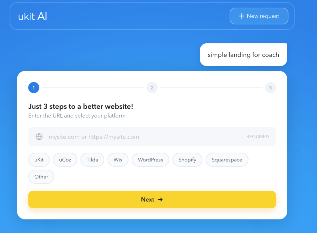
When the content is right and the presentation is the problem. If a client’s site has accurate, reasonably specific copy and the main issues are technical – not mobile-responsive, running on HTTP, looks dated – an AI upgrade addresses the real problem directly. This is a meaningful category. There are a lot of sites where the business has evolved and the content is good, but the site has not been visually maintained.
As a reference draft for a deeper conversation. For clients who struggle to articulate what they want, an AI-generated version of their current site gives them something concrete to react to. That reaction – “I like this but not that, I want more emphasis here, the tone feels too formal” – is much more useful input for a real redesign than an abstract discussion about brand direction.
When survey data is informing the content decisions alongside the visual upgrade. One of the most effective combinations I have seen is an AI visual upgrade paired with structured feedback collection about what visitors actually find useful or confusing on the current site. The survey data shapes the content edits that go on top of the visual foundation. If you are not already collecting this kind of feedback systematically, the comparison in SurveyNinja vs Tally is worth reading before you decide on a tool – the operational differences between platforms matter more than they appear on a feature list.
For adding interactive utility after the foundation is set. A fast, mobile-responsive site is a better platform for interactive elements than a dated, slow one. If the business needs a pricing calculator, a scope estimator, or a quote request tool, the AI upgrade creates the right technical environment for adding it.
Read also: No-Code Calculator Builders: Templates, Branding and Integrations Compared
Where I Would Handle It Differently
When content needs to change alongside the design. If the business has shifted significantly since the site was built – new services, different target customers, a sharper value proposition – an upgrade from the existing content is not going to reflect where the business actually is. That is a content project first and a visual project second.
When brand differentiation is the point. Generic-but-modern is the right outcome for some projects. When the competitive context means the business needs to feel specifically different from its competitors – not just current – the defaults an AI applies are not going to get there. That requires design judgment: understanding what makes this brand distinctive and making visual choices that express it.
When the site has backend functionality that needs to carry over. An AI upgrade works with the front-end presentation layer. Any custom forms, integrations, or server-side logic in the original site does not migrate. For sites where those elements are part of how the business operates online, a platform-specific upgrade is not the right instrument.
The Takeaway
AI-powered website upgrades like uKit AI help build clearer, faster, and more useful websites in specific circumstances: when the presentation is the primary problem, the content is mostly sound, and the outcome is a site that meets current technical and visual standards rather than a custom expression of a specific brand. Used in the right context, the speed advantage is genuine and the output is valuable. Used where the message, the structure, or the brand differentiation needs real thinking, the visual upgrade surfaces those remaining problems more clearly than it solves them – which is still useful, but different from what the pitch implies.